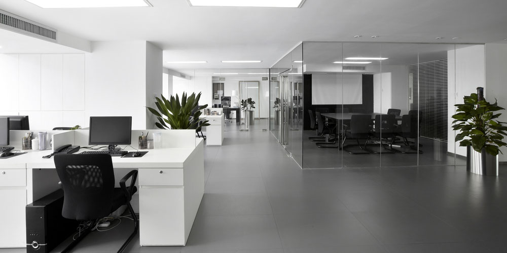
Commercial Painting
Now that you are reading this article, you are definitely thinking about painting your work environment, and you are looking for a pure idea or a skilled master for this work. Many people who leave home in the morning to go to work, try on clothes and ironing, tidy their hair and put on their clean shoes. As they arrive at work full of energy and freshness, after a while, they become lethargic and bored and go about their daily lives. One of the factors that creates such a feeling is the environment around people and among all the things that seeing them has a great impact on their inner feelings. The workplace is one of the most important in which a lot of time is spent. We can make a fundamental change in our work environment by commercial painting colors.

The first step is to pay attention to what you want, and this question will be answered according to what your job is and what activity you are going to do in your workplace. For example, if you are a lawyer, use white, gray and cream colors that convey a sense of calm and confidence to the client. If you are selling, use red, orange and purple colors that convey the feeling of excitement to buy to the customer. If you have an idea for coloring, you can share it with an expert, and he can guide you.
What color is suitable for Commercial Painting?
Commercial painting colors are very important to think more before painting. Green and blue can create a feeling of calm and security in employees. Green relaxes the eyes and helps to reduce anxiety. This is especially useful in cases where the brightness is not good or employees spend the day staring at the computer screen. Blue helps to reduce stress by lowering blood pressure and heart rate. Some studies suggest that people in blue rooms are productive. Conversely, dark colors can evoke a sense of sadness.

Yellow and orange colors make a person feel warm and happy. When these colors are too bright, they can lead to hunger, anger and frustration. Yellow in the workplace can cause eye strain by over-irritating the eyes; this causes harassment of employees.
Red excites employees. It can increase breathing, heart rate and brain activity. Red is best used as a complement rather than as a primary color. Red can evoke feelings of love, passion and danger and attract attention in many ways.
Pink can have a calming effect on employees. However, pink is not usually used for work. White can be the cause of eye strain. However, it conveys a feeling of sterility and cleanliness, although the color is not very irritating.
Where the colors are at their best:

Cool colors are best for workplaces where people need to relax. Law firms, psychiatric clinics, accountants, libraries, counseling rooms, and public places make the most of these colors. Even for production workshops, a combination of blue and green soothes the space. White is suitable for places such as hospitals or laboratories where sterile operations are performed. The point about hospitals and medical centers is that their color is better to be antibacterial. Libraries and research sites can use olive color. These colors stimulate concentration and help study and focus.
Where the people do business affairs, they deal with a lot of customers, such as banks, stores, lounges and entertainment areas. Choosing the right color for crowded places can be an important factor in customer and employee satisfaction.


No comment